-
Robot
Most Wanted

- Rep Power
- 82
 Microsoft Redesigns Microsoft 365 Icons With Brighter, Fluid Visuals
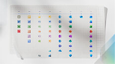
Microsoft has officially unveiled a redesigned icon pack for its core Office apps, which are found within the Microsoft 365 service. The 10 primary application marks now sport brighter colors, a more playful tone, and softer contours inspired by the company's Copilot emblem. This is the first large-scale update since 2018, and it will be available on web, desktop, and mobile platforms in the coming weeks. The 10 core apps include Teams, Word, Excel, PowerPoint, Outlook, OneNote, Defender, OneDrive, Designer, and Clipchamp. All 10 of these core applications now have redesigned icons following fluid forms and vibrant colors. On the surface, these are visual changes, yet the company frames them as a sign of context-aware tools that blend AI assistance with human intent.
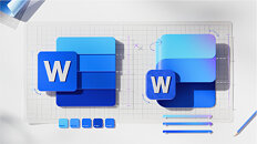
Under the new look, the icons move away from blocky solidity and toward folded, curved forms that suggest motion and approachability. Designers simplified details to keep each mark clear at small sizes. For example, Word now shows three horizontal bars instead of four to improve legibility. The palettes are richer, featuring exaggerated analogous gradients designed to enhance contrast across various displays and support accessibility. Letter plates remain where brand recognition matters, but proportions, texture, and spacing were modernized, so the icons feel cohesive with Copilot and recent Microsoft products. For most people, the change will be a visual refresh, brighter, simpler tiles appearing across their devices, but Microsoft says the icons are intended to reflect a larger evolution in product making where interfaces and AI work together to help people reach their desired outcomes faster.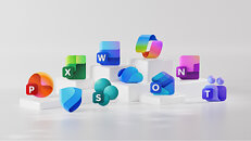
More...
 Posting Permissions
- You may not post new threads
- You may not post replies
- You may not post attachments
- You may not edit your posts
-
Forum Rules


